
Brand concept · Sparkling wine
Bollicine
An occasion in itself.
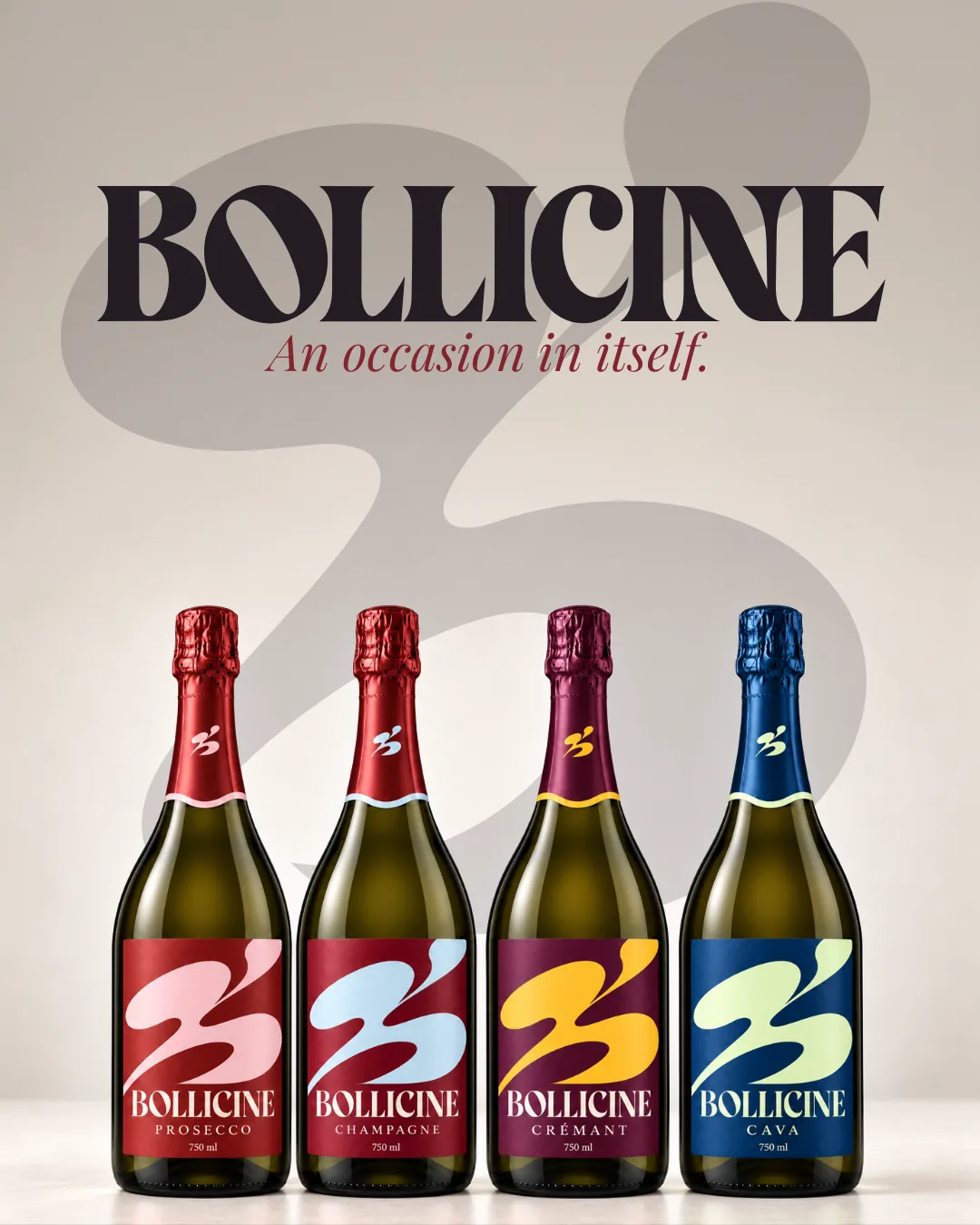
A sparkling wine brand concept. Bollicine is Italian for “little bubbles,” so I built the identity around one playful, bubbling mark and gave each of the four wines its own color pair: Champagne, Crémant, Cava and Prosecco.
01 · Logo & mark
One bubbling mark. Four wines.
A high-contrast wordmark with a little swagger, and a fluid B that reads like bubbles rising. The mark sits on the neck of every bottle and fills each front label in that wine’s colors.
Wordmark Stacked logo
 Mark
02 · Color & type
A color pair for every wine.
Each wine gets a deep base and a bright partner, so the range reads as one family on the shelf and each bottle is easy to tell apart. Ink and ivory hold everything together.
#641D3C#B9D5DF#542B58#E8B84E#293A69#D4DDB2#A84132#E7B5C5#29212E#F5EBDDBodoni Std BookDisplay: headlines and wine names
Baskerville ProEditorial: body copy and italic accents
Futura PT DemiDetails: captions, wine names, 750 ML / SERVE CHILLED
03 · Labels & packaging
The occasion starts here.
Front labels lead with the mark in the wine’s colors. Back labels switch to ivory and a short line of copy. The gift box carries the mark large, with a red interior for the reveal.
04 · Campaign
An occasion in itself.
Campaign imagery that keeps the brand loud and social: big type, bright color and people at the table.